
START
Meditrue had a strong brand identity on paper but a website that felt generic — it could have been any marketing agency, not a company specialising in healthcare. The real challenge wasn't aesthetics. It was credibility: medical professionals don't hire partners who don't immediately feel trustworthy and methodical.
PROCESS
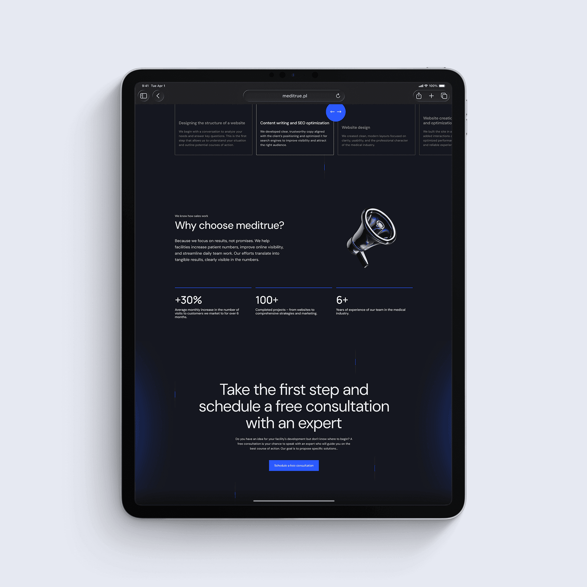
Instead of leading with services, I restructured the information architecture around Meditrue's process. Clinics choosing a marketing partner need to understand how you work before they care what you offer. The visual language was built on restraint — whitespace, precision typography, and a small set of 3D elements used sparingly to add authority without overwhelming medical sensibility. The CTA flow was mapped to the decision journey of a clinic director: awareness → consideration → contact, with each section answering the question they'd have at that stage.
OUTCOME
The final site positions Meditrue as a partner who thinks in systems, not just campaigns. What previously felt like a generic agency now reads as a specialist. The team can manage content independently.